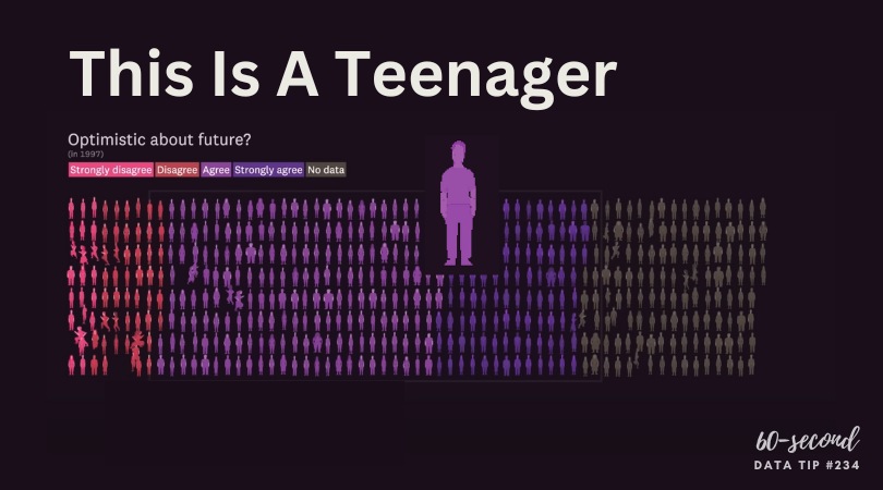
My tip this week is to check out This Is A Teenager by Alvin Chang at The Pudding. It’s a visual essay that traces the paths of hundreds of teenagers, starting in 1997, to see how their childhood experiences relate to their life outcomes. You can view it in video form (see below) or as a scrolling visualization HERE. The actual teenagers behind the data* don’t get lost in aggregates represented by bars, lines, and circles. Instead, we see them as individuals whose lives tend to follow the paths of other individuals with similar childhood experiences.
* The data is from the National Longitudinal Survey of Youth.
Source: The Pudding
To see past data tips, click HERE.
Let’s talk about YOUR data!
Got the feeling that you and your colleagues would use your data more effectively if you could see it better? Data Viz for Nonprofits (DVN) can help you get the ball rolling with an interactive data dashboard and beautiful charts, maps, and graphs for your next presentation, report, proposal, or webpage. Through a short-term consultation, we can help you to clarify the questions you want to answer and goals you want to track. DVN then visualizes your data to address those questions and track those goals.