Another Data Viz Resource You Should Know: USAFacts

Here’s a new addition to my highly-curated resources list: USAFacts. I occasionally write a 60-second data tip describing a particular resource, including why I think it’s cool. And I link each of these tips to a resources list on my website.

What is it?

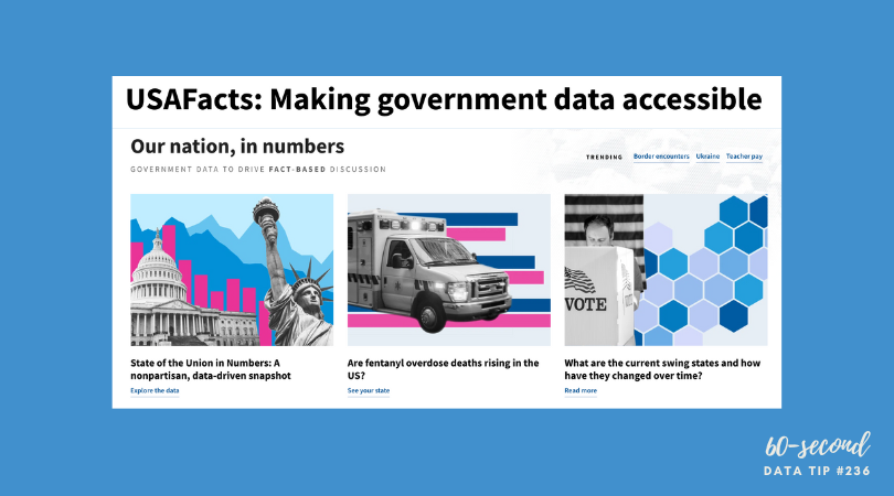
USAFacts is dedicated to making government data more accessible. The idea is to help people understand where their tax dollars are going and to help those working on issues of concern in the philanthropic, nonprofit, and public sectors to easily access information to inform their decisions.

Who’s it for?

The general public, policymakers, philanthropists, nonprofit managers, and researchers, among others.

Who’s behind it?

After he retired from tech and began to focus on philanthropy, former Microsoft CEO Steve Ballmer wanted to understand what the government spends on programs to help people and the outcomes of those programs. However, unlike businesses, US governments are not mandated to compile reports on their expenditures. He then hired data analysts to compile this data, and this was the origin of USAFacts, a not-for-profit, nonpartisan civic initiative which is solely funded by Ballmer.

Why I think it’s cool

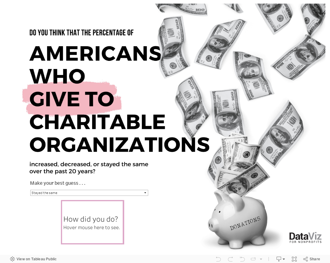
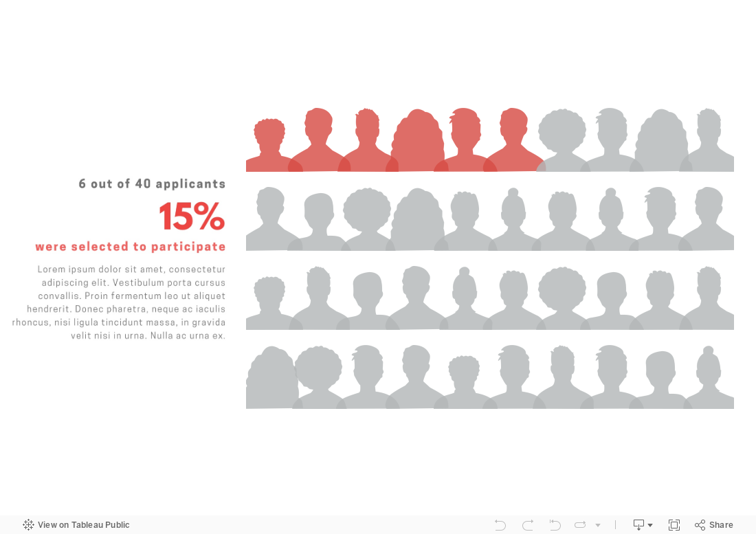
It’s free and the data is shared under a Creative Commons license. They only ask that you credit USAFacts when using their curated material. Most of their data is visualized and all of it is well-documented. Charts can be easily downloaded in an image format or embedded into your website using an embed code like the chart below.


Let’s talk about YOUR data!

Got the feeling that you and your colleagues would use your data more effectively if you could see it better? Data Viz for Nonprofits (DVN) can help you get the ball rolling with an interactive data dashboard and beautiful charts, maps, and graphs for your next presentation, report, proposal, or webpage. Through a short-term consultation, we can help you to clarify the questions you want to answer and goals you want to track. DVN then visualizes your data to address those questions and track those goals.


Emphasize The Shape of Your Data

“There is a magic in graphs. The profile of a curve reveals in a flash a whole situation — the life history of an epidemic, a panic, or an era of prosperity. The curve informs the mind, awakens the imagination, convinces.” – Henry D. Hubbard in the preface to William C. Brinton’s Graphic Presentation, 1939.

Data visualization translates words and numbers into visual cues such as color, size, position, and shape. Humans can process such visual cues much more easily and quickly than words and numbers. Today, I’m here to talk about shape because I don’t think we turn to shape often enough to engage and educate with data. The three area charts below provide a great example of the power of shape. The charts show estimates of the distribution of annual income among all world citizens over the last two centuries. By considering the change in the shape of the data across the three time periods and in relation to the poverty line, we learn a lot. Most significantly, we learn that, over the 215 year time period, the majority of people went from living below the poverty line to living above it. We learn even more by considering the shape of the distribution for each color-coded region.

So consider taking a page from this playbook. Rather than showing change over time in one chart. Consider using shape to tell the story by showing the distribution of something (e.g. income, course grades, number of clients) at different time periods in adjacent area charts.


Let’s talk about YOUR data!

Got the feeling that you and your colleagues would use your data more effectively if you could see it better? Data Viz for Nonprofits (DVN) can help you get the ball rolling with an interactive data dashboard and beautiful charts, maps, and graphs for your next presentation, report, proposal, or webpage. Through a short-term consultation, we can help you to clarify the questions you want to answer and goals you want to track. DVN then visualizes your data to address those questions and track those goals.


This Is A Teenager: Showing The People Behind The Data

My tip this week is to check out This Is A Teenager by Alvin Chang at The Pudding. It’s a visual essay that traces the paths of hundreds of teenagers, starting in 1997, to see how their childhood experiences relate to their life outcomes. You can view it in video form (see below) or as a scrolling visualization HERE. The actual teenagers behind the data* don’t get lost in aggregates represented by bars, lines, and circles. Instead, we see them as individuals whose lives tend to follow the paths of other individuals with similar childhood experiences.

* The data is from the National Longitudinal Survey of Youth.

Source: The Pudding

To see past data tips, click HERE.


Let’s talk about YOUR data!

Got the feeling that you and your colleagues would use your data more effectively if you could see it better? Data Viz for Nonprofits (DVN) can help you get the ball rolling with an interactive data dashboard and beautiful charts, maps, and graphs for your next presentation, report, proposal, or webpage. Through a short-term consultation, we can help you to clarify the questions you want to answer and goals you want to track. DVN then visualizes your data to address those questions and track those goals.


Data Viz Resources You Should Know: Data.gov

Here’s a new addition to my highly-curated resources list: Data.gov. I occasionally write a 60-second data tip describing a particular resource, including why I think it’s cool. And I link each of these tips to a resources list on my website.

What is it?

Data.gov is the United States government’s open data site. Open data is data that can be freely used, re-used, and redistributed by anyone - subject only, at most, to the requirement to attribute and sharealike. Data.gov is designed to “unleash the power of government open data to inform decisions by the public and policymakers, drive innovation and economic activity, achieve agency missions, and strengthen the foundation of an open and transparent government.”

Who’s it for?

It’s for the general public.

Who’s behind it?

The U.S. government. More specifically, The U.S. General Services Administration, working with the Office of Management and Budget and other agency partners, launched Data.gov in 2009. Government agencies compile metadata such as title, description, keywords, and links for accessing their datasets, and the Data.gov catalog automatically “harvests” that metadata to populate a continually updated catalog.

Why I think it’s cool

Unlike many other open data catalogs, you can find and download data quickly and visualize it. You can begin by searching for keywords in the search box. And there are helpful filters to narrow the results by, for example, topic categories, location, and agency. This is a great place to find data to show the need for your organization’s services and the problems you and your colleagues are working to address.


Let’s talk about YOUR data!

Got the feeling that you and your colleagues would use your data more effectively if you could see it better? Data Viz for Nonprofits (DVN) can help you get the ball rolling with an interactive data dashboard and beautiful charts, maps, and graphs for your next presentation, report, proposal, or webpage. Through a short-term consultation, we can help you to clarify the questions you want to answer and goals you want to track. DVN then visualizes your data to address those questions and track those goals.


10 Essential Data Facts For Non-Data People: The Cheat Sheet

Reposted from January 2022

Here are ten data facts for non-data people who, nevertheless, have to deal with data sometimes (i.e. most of us). This is the cheat sheet. Click on the “Learn More” buttons for additional information served up in comic strip format!


Let’s talk about YOUR data!

Got the feeling that you and your colleagues would use your data more effectively if you could see it better? Data Viz for Nonprofits (DVN) can help you get the ball rolling with an interactive data dashboard and beautiful charts, maps, and graphs for your next presentation, report, proposal, or webpage. Through a short-term consultation, we can help you to clarify the questions you want to answer and goals you want to track. DVN then visualizes your data to address those questions and track those goals.


The Power of Substraction

“Perfection is achieved, not when there is nothing more to add, but when there is nothing left to take away.”

―Antoine de Saint-Exupéry, Airman's Odyssey

If you have heard of any data viz guru, it’s probably Edward Tufte. And if you know one thing about Tufte, it’s probably the data-to-ink ratio. The data-to-ink ratio is the amount of ink (or pixels) that convey the data divided by the total ink (or pixels) used in the entire chart. The ratio, according to Tufte, should be as close to one as possible. In other words, most of the ink/pixels should be conveying data, and you should remove as much non-data ink/pixels as possible. Click through Joey Cherdarchuk’s slides below for a great example of what Tufte is talking about.

Source: Darkhorse Analytics

To see past data tips, click HERE.


Let’s talk about YOUR data!

Got the feeling that you and your colleagues would use your data more effectively if you could see it better? Data Viz for Nonprofits (DVN) can help you get the ball rolling with an interactive data dashboard and beautiful charts, maps, and graphs for your next presentation, report, proposal, or webpage. Through a short-term consultation, we can help you to clarify the questions you want to answer and goals you want to track. DVN then visualizes your data to address those questions and track those goals.


Presenting Data Fast and Slow

Reposted from May 2022

Sometimes we approach the challenge of sharing data with others as if we were trying to con a pet into taking a pill. We think that our audience is too busy, disinterested, or distracted to focus on the data. So we wrap it in something that attracts their attention and feed it to them as quickly as possible. The problem with this approach is that it may get the data into their brains—momentarily—but it won’t stay there long. See where the pill ends up in this video.

If we want others to LEARN from the data — which involves not only retaining it but also drawing knowledge from it and applying that knowledge in the future — then we need a different approach. Daniel Kahneman’s Thinking Fast and Slow can help us.

First a little background on how the brain works, according to the evidence Kahneman presents. For learning to happen, information first must get past System 1 of our brains. This is where fast thinking happens. System 1 is the harried gate keeper, madly processing all of the information that comes in through our senses, pitching most of it, keeping only what is deemed necessary. But making it through the gate is only half the battle. Once in, information confronts System 2. This is the part of the brain that allows for conscious thought or slow thinking. The problem is that System 2 is lazy. Conscious thought is hard, and System 2 is always looking for an excuse to avoid it. However, if System 2 engages with information, the resulting knowledge can find its way to long-term memory and learning happens.

So the challenge when presenting data is to make it past System 1 AND engage System 2. Let’s consider a series of vizes from Harvard Business Review (HBR) that I think meets both parts of this challenge. Yes, it’s an example from the for-profit world, but could easily work with nonprofit data. See snapshot of the first viz in the series below .

How to get data past System 1

Getting data past the System 1 fast-thinking gate keeper is all about grabbing attention. We process images much more quickly than words and numbers, so images are a great foot-in-the-door. The HBR viz does it with bright colors and a cool-looking, somewhat unusual chart. There’s plenty of information out there about how to attract attention, including the use of images with:

  • Stand out colors and textures

  • Human faces (we are wired to focus on them)

  • Novelty (images that are unusual in size, placement, etc.)

Data visualizations can use color as well as images to draw attention. But getting past System 1 is not nearly enough. For learning to happen, the viz also has to engage System 2.

How to engage System 2

System 2 is smart but lazy. So we need to pique its interest. The HBR viz starts with a title that poses a question. When confronted with an interesting question, we may be more likely to stick around for an answer. Then the viz leads you through the answer in a visually engaging way (see interactive version of the viz HERE). These are two great ways to slow down and engage the brain with data. Here’s a list of ways to engage System 2:

  • Ask a question in the title as the HBR viz does—questions beg answers.

  • Make it personal. We may be more likely to engage with data when we have a personal connection with it. This New York Times viz, for example, allows you to enter in your county to see what the barriers to COVID vaccination are in your area.

  • Highlight a surprising finding. Many of us love the counterintuitive and the creative. If you draw attention to something new that the data suggests, you may have a better chance at hooking System 2. For example, this viz from The Economist shows that China emits far less greenhouse gas per person than Western countries at the same stage of economic development. Or check out this viz by Dimiter Toshkov showing that small countries can be big players in development and good governance.

  • Hand draw it. There is some evidence that making information harder to consume, for example by presenting it with harder-to-read fonts, makes the brain slow down and engage in effortful and analytic processing. Although the jury is still out on this, I do find myself more likely to engage in hand-drawn vizes like two of the winners of the World Data Visualization Prize in 2019. Perhaps it’s simply the novelty of hand-drawn charts that engages me. Anyway, it’s something you might consider, and all you need is a pen and paper.

  • Walk them through it. A great way to slow down your viewers is to set the pace by walking them through the data as HBR does in the example. I love how HBR presents what the data might look like if our assumptions were confirmed followed by what it actually looks like.

Sources: Veritasium, Visual Content Space, MIT News, Springer Link,


Let’s talk about YOUR data!

Got the feeling that you and your colleagues would use your data more effectively if you could see it better? Data Viz for Nonprofits (DVN) can help you get the ball rolling with an interactive data dashboard and beautiful charts, maps, and graphs for your next presentation, report, proposal, or webpage. Through a short-term consultation, we can help you to clarify the questions you want to answer and goals you want to track. DVN then visualizes your data to address those questions and track those goals.


How To Present Data on Slides

“It’s not the mere presence of data that gives the presenter power,” notes Joel Schwartzberg in his Harvard Business Review article on presenting data, “It’s how that data is presented.” Below is my 60-second review of Schwartzberg’s helpful tips. But before you scroll down, see how much you already know. Take a look at the “Before” slide below and consider what changes you would make to it. Then advance to the “After” slide (by clicking on the right side of the image) to see a revised version that follows Schwartzberg’s guidelines.

  • One point per slide. Have one key takeaway for each slide and write a slide title that reinforces your point rather than something generic like “Performance by Quarter in 2023.”

  • Visually highlight “Aha” zones. Use a bright color to direct attention to a key data point and gray out the rest.

  • Make charts readable from across the room. If you have to say “You probably can’t read this but it shows that . . . “ then it needs revision. Don’t use font sizes smaller than 18 points.

  • Labels are clear and intuitive. Your audience needs to decode your chart in a few seconds. Make sure axis and data labels are understandable.

To see past data tips, click HERE.


Let’s talk about YOUR data!

Got the feeling that you and your colleagues would use your data more effectively if you could see it better? Data Viz for Nonprofits (DVN) can help you get the ball rolling with an interactive data dashboard and beautiful charts, maps, and graphs for your next presentation, report, proposal, or webpage. Through a short-term consultation, we can help you to clarify the questions you want to answer and goals you want to track. DVN then visualizes your data to address those questions and track those goals.


How To Check Your Data Blind Spots

You’ve heard it before. We see what we want to see. It’s called confirmation bias, and we are all susceptible. Confirmation bias is a big problem to those presenting or consuming data (i.e. all of us.) How can we draw our own and others’ attention to the data that does NOT fit our existing beliefs? How, in other words, can we check our blind spots?

The great thing about your blind spot when it comes to driving is that you know it exists. Your rearview mirrors do not show you an area next to and behind your car. So you learn to check that area in a different way. Experienced drivers do it by rote. Wouldn’t it be great if we also could remember that we have data blind spots and learn to check them automatically?

Here are some ideas for making your blind spots visible. All of them involve doing something before you look at data (in the form of a spreadsheet, table, chart, map, or graph) to help you look at the data with fresh eyes.

  1. Make predictions before looking at data. To prevent seeing only the data that confirm our beliefs, we can make predictions before looking at the data. In Staff Making Meaning from Evaluation Data, Lenka Berkowitz and Elena “Noon” Kuo suggest that, before sharing data with program staff, “have them spend 10 minutes writing down predictions about what the data will say. This exercise helps surface beliefs, assumptions, and biases that may otherwise remain unconscious.” This can involve drawing a predicted trend in the data or jotting down guesstimates of key data points. Then look for differences between your predictions and the actual data and consider:

    • What may have contributed to the differences,

    • What more do you need to know to take action, and 

    • What actions might you consider immediately?

  2. Consider your “null hypothesis” before looking at data. This approach is a variation on strategy number one.  Rather than making a prediction, you pose this question to yourself: If what I expect is NOT true, what might I see? This is analogous to how researchers conduct experiments.  Rather than trying to prove that a hypothesis (e.g. A is affecting B) is correct, researchers aim to collect sufficient evidence to overturn the presumption of no effect, otherwise known as the null hypothesis. It’s sort of like innocent until proven guilty. The idea is to take the opposite view to the one that you hold and then look for evidence to support it. If you can’t find that evidence, then your assumption might be correct. This approach makes you think more critically and perhaps more dispassionately when encountering data.

  3. Set decision criteria before looking at data. “Many people only use data to feel better about decisions they’ve already made,” notes Cassie Kozyrkov in Data-Driven? Think again. To avoid this, you can frame your decision-making in a way that prevents you from moving the goalposts after you’ve seen where the ball landed. Before considering the data, determine your cutoffs for action. For example, you and your colleagues might decide that program participation below 150 in any given month requires investigation and possible action. Let’s say that twelve-month data show participation below 150 in six months. The pre-established cutoff can prevent you from only focusing on the worst months when participation was below 75.


Let’s talk about YOUR data!

Got the feeling that you and your colleagues would use your data more effectively if you could see it better? Data Viz for Nonprofits (DVN) can help you get the ball rolling with an interactive data dashboard and beautiful charts, maps, and graphs for your next presentation, report, proposal, or webpage. Through a short-term consultation, we can help you to clarify the questions you want to answer and goals you want to track. DVN then visualizes your data to address those questions and track those goals.


How and Why to Visualize Variability

Every dataset includes variability. The people and things we measure differ from one another in many ways. And visualizing data always involves some decisions about how much of that variability to show. There are tradeoffs:

  1. If you show too much variability, you obscure patterns and trends. To understand anything with data, we usually need to reduce its complexity. We can’t extract meaning from a table full of numbers and letters. So we summarize the data through such activities as grouping people, concepts, and time periods; calculating averages; or organizing individuals or groups in a rank order. This process allows us to detect patterns and trends within the data. Patterns and trends become even more apparent when we visualize the data in the form charts, maps, and graphs by assigning visual cues such as color, size, and shape to groups and values. However, too many colors, sizes, and shapes make discerning the patterns and trends more difficult.

  2. If you show too little variability, you obscure reality*. Overly simplified visualizations do not show just how complex and messy the data actually is. And the viewer may mistake the simplified, summarized version of the data as reality.

You can find a great example of problem #2 in Eli Holder’s article Divisive Dataviz: How Political Data Journalism Divides Our Democracy. He describes the danger of red and blue political maps in the U.S. in this way: “there’s no such thing as a “red state” or a “blue state.” Consider Texas, which is often called a “red” state. In the 2020 presidential election, more Texans voted for Joe Biden (5.26 million) than every other “blue” state, except for California. Even New York, a Democratic stronghold, had roughly 20,000 fewer Biden voters than Texas. . . . While popular election maps accurately reflect the ‘winner-take-all’ dynamic of the electoral college, they create the misimpression that state electorates are monolithic blocks of only-Republicans or only-Democrats.”

And the misimpressions such maps engender have real-world consequences. Holder describes an experiment in which people were shown either dichotomous maps or continuous maps (see examples below). Those shown dichotomous maps were more likely than those shown continuous maps to feel that their state was dominated by one party and thus that their votes mattered less because the election outcome was a foregone conclusion.

So when deciding how many shades of gray or circle sizes to show, consider how much summarization is needed to make patterns and trends perceptible without misleading the viewer with an oversimplified view of the data. Take, for example, these three versions of a map. They each show the same CDC chronic illness survey data with a “diverging color palette” in which blue states ranked high on health indexes; orange states ranked low; and gray states were in the middle. The maps differ in the degree of variability shown. Which map allows you to see corridors of good and bad health without oversimplifying the matter?

*More specifically, the full reality of the data. This 60-second data tip doesn’t get into the nature of reality in general!

To see past data tips, click HERE.


Let’s talk about YOUR data!

Got the feeling that you and your colleagues would use your data more effectively if you could see it better? Data Viz for Nonprofits (DVN) can help you get the ball rolling with an interactive data dashboard and beautiful charts, maps, and graphs for your next presentation, report, proposal, or webpage. Through a short-term consultation, we can help you to clarify the questions you want to answer and goals you want to track. DVN then visualizes your data to address those questions and track those goals.


One Dataset, 100 visualizations

Today’s tip is to check out the 1 dataset, 100 visualizations project. It shows 100 different ways to visualize this simple dataset:


It’s fun to compare the different charts and see how they provide different perspectives on the data. For example, to visualize this data, many of us would create a stacked bar chart like this one and call it a day.


But look at how this chart allows you to better understand each country’s relative position in relation to number of world heritage sites between 2004 and 2022. We can more easily see, for example, that Denmark leapfrogged Norway.


These 100 charts make a strong case for visualizing your data in a number of different ways before selecting one which provides the perspective needed.


To see past data tips, click HERE.


Let’s talk about YOUR data!

Got the feeling that you and your colleagues would use your data more effectively if you could see it better? Data Viz for Nonprofits (DVN) can help you get the ball rolling with an interactive data dashboard and beautiful charts, maps, and graphs for your next presentation, report, proposal, or webpage. Through a short-term consultation, we can help you to clarify the questions you want to answer and goals you want to track. DVN then visualizes your data to address those questions and track those goals.


How To Balance Your Information Diet

Here’s a question for you. And don’t go Googling. Just make your best guess.

Have the number of people experiencing homelessness in the U.S. increased or decreased since 2007?

Whatever your answer, you likely drew on your own personal experience as well as images and information from the media when guessing at the answer. Perhaps you drew on some statistics too. But, unless you have expertise in this area, probably not. Stick with me for a minute, and I’ll not only provide an answer to the question but also some insight into how we consume information.

Personal experience, media, and statistics affect how we understand any issue, and there are limits to each of these inputs. So we would do well to understand those limits before acting on our understanding by voting, donating, or making decisions about programs that our organizations operate. Max Roser’s article in Our World in Data (The limits of our personal experience and the value of statistics) walks us through some of those limitations:

Personal Experience

“The world is large, and we can experience only very little of it personally,” Roser notes. “For every person you know, there are ten million people you do not know.” Even the most social and well-traveled among us can have only a limited understanding of the world through personal experience. I, for example, do not know anyone personally who has been unhoused, and most of my interactions with people in this situation occur on the street when someone asks me for money. This experience provides no information about the breadth of the problem or the range of experiences with this issue over time.

Media

“This fact is so obvious that it is easy to miss how important it is: everything you hear about anyone who is more than a few dozen meters away, you know through some form of media,” Roser points out. “The news reports on the unusual things that happen on a particular day, but the things that happen every day never get mentioned. This gives us a biased and incomplete picture of the world; we are inundated with detailed news on terrorism but hardly ever hear of everyday tragedies like the fact that 16,000 children die every single day.” If I recently heard a story about a city clearing homeless encampments, I may assess the problem as larger, and if I haven’t heard about anything on the issue in awhile, I may assess it as smaller.

Statistics

“The collection and production of good statistics is a major challenge,” writes Roser. “Data might be unrepresentative in some ways, it might be mismeasured, and some data might be missing entirely.” But, unlike personal experience and the media, it provides a way of assessing the full range of an issue. So it’s important to add statistics, along with personal experience and the media, to our information diet.

To add some statistics to your understanding of homelessness, the number of people experiencing homelessness in the U.S. decreased from about 650,000 in 2007 to about 580,000 (about 18 of every 10,000 people) in 2022 according to The 2022 Annual Homelessness Assessment Report to Congress.

We should not discount personal experience, the media, or statistics because of their limitations. But we should appreciate their limitations when forming opinions and taking actions based on them. As Roser notes: “Each way of learning about the world has its value. It’s about how we bring them together: the in-depth understanding that only personal interaction can give us, the focus on the powerful and unusual that the news offers, and the statistical view that gives us the opportunity to see everyone.” As described in many tips in this blog, well-designed charts make data/statistics more accessible to everyone and thus allow everyone to see everyone.


Let’s talk about YOUR data!

Got the feeling that you and your colleagues would use your data more effectively if you could see it better? Data Viz for Nonprofits (DVN) can help you get the ball rolling with an interactive data dashboard and beautiful charts, maps, and graphs for your next presentation, report, proposal, or webpage. Through a short-term consultation, we can help you to clarify the questions you want to answer and goals you want to track. DVN then visualizes your data to address those questions and track those goals.


Upcoming Data Viz Workshops


Let’s talk about YOUR data!

Got the feeling that you and your colleagues would use your data more effectively if you could see it better? Data Viz for Nonprofits (DVN) can help you get the ball rolling with an interactive data dashboard and beautiful charts, maps, and graphs for your next presentation, report, proposal, or webpage. Through a short-term consultation, we can help you to clarify the questions you want to answer and goals you want to track. DVN then visualizes your data to address those questions and track those goals.


Free Interactive Viz For You: Giving in the U.S.

As we move into gifting season, I thought I’d toss out a gift to you. It’s a quick interactive viz that you can employ however you see fit. Use it in a website, presentation, or social media post to rightsize folks’ understanding about the state of charitable giving in the U.S. and, perhaps, help to turn the tide. For the link address or embed code, click on the share icon below.


Let’s talk about YOUR data!

Got the feeling that you and your colleagues would use your data more effectively if you could see it better? Data Viz for Nonprofits (DVN) can help you get the ball rolling with an interactive data dashboard and beautiful charts, maps, and graphs for your next presentation, report, proposal, or webpage. Through a short-term consultation, we can help you to clarify the questions you want to answer and goals you want to track. DVN then visualizes your data to address those questions and track those goals.


Nonprofits Need This Dashboard

Does your nonprofit have participants (or volunteers or clients or human beings of another sort) in various programs? If so, you could benefit from a dashboard like this one (see below). Give it a spin. Select a program at the top to highlight participants in that program in the charts. This dashboard allows for easy comparisons across programs, across statuses (e.g. enrolled, waitlisted, and withdrawn), and across time. Scroll over charts to learn more.

My inspiration for this dashboard came from Eve Thomas at The Data School. Check out Eve’s article, which includes instructions for creating this type of dashboard with Tableau (assuming basic Tableau knowledge.)


Let’s talk about YOUR data!

Got the feeling that you and your colleagues would use your data more effectively if you could see it better? Data Viz for Nonprofits (DVN) can help you get the ball rolling with an interactive data dashboard and beautiful charts, maps, and graphs for your next presentation, report, proposal, or webpage. Through a short-term consultation, we can help you to clarify the questions you want to answer and goals you want to track. DVN then visualizes your data to address those questions and track those goals.


The Pies That Bind

Reposted from November 2022

Rather than provide you with a tip, I thought I’d start this holiday week by offering you a little hope instead. It’s pie season, and folks are searching for pie recipes on Pinterest. According to this Food & Wine article, Pinterest analyzed internal search data to discover the most common pie recipe search terms in each state. I took that data and mapped it. As you can see below, pie preferences do not appear to fall along regional, ideological, or even agricultural lines. Minnesotans love lemon pie, and Floridians love pumpkin pie, although I’m guessing that more lemons are grown in Florida and pumpkins in Minnesota. Some states were idiosyncratic in their searches. Hello West Virginians who love no-bake peanut butter pies and Kentuckians who love pies made with cushaws, a type of squash I’d never heard of. But most states shared pie interests with other states. So this Thanksgiving, let’s be thankful for our shared love of pie. Scroll around on the vizes below and Happy Thanksgiving!


Let’s talk about YOUR data!

Got the feeling that you and your colleagues would use your data more effectively if you could see it better? Data Viz for Nonprofits (DVN) can help you get the ball rolling with an interactive data dashboard and beautiful charts, maps, and graphs for your next presentation, report, proposal, or webpage. Through a short-term consultation, we can help you to clarify the questions you want to answer and goals you want to track. DVN then visualizes your data to address those questions and track those goals.


Not Your Grandmother's Icons

We have all seen icon charts that look like this (even if our grandmother didn’t create them):

Want to make an icon chart that actually looks like real people as in the example below? Well, of course, you can just find some cool silhouette icons and use any graphic design program — such as Canva or Adobe Illustrator —  to layout and color icons as you wish. However, if you want the chart to be interactive, you will need to use a program like Tableau or Power BI. I created the chart below in Tableau. It provides more information when you scroll over the icons. Scroll down for Tableau instructions.

Here’s how I did it:

(Note: These directions assume basic knowledge of Tableau. If you don’t have that knowledge, here’s a good video on Tableau basics.)

  1. I selected 10 head silhouettes to use as icons. You can find great (free) icons on sites like flaticon , The Noun Project, or Canva. Be sure to save each icon as a separate PNG file with a transparent background.

  2. I added the icons to the shapes folder in my Tableau Repository. Here’s a short video on how to do that.

  3. I connected a data file (such as an Excel or CSV file) to Tableau Public (the free version of Tableau). The file included 40 rows, one for each applicant, and columns for:  a unique identifier for applicants (such as an ID number), selection status (whether applicants was or wasn’t selected to be a participant, and 3) the silhouette image assigned to the applicant.

  4. In Tableau, I started a new worksheet, changed the marks type to shape, and dragged:

    1. The ID number to the columns shelf (note that ID number should be a dimension not a measure);

    2. The selection status dimension to color on the marks card; and

    3. The silhouette dimension to shape on the marks card.

  5. I clicked on shape on the marks card, clicked on “Reload Shapes,” selected the shape palette that I added to my Tableau Repository in Step 2,  assigned head shapes to the various values for the silhouette dimension., and then clicked “OK.”

  6. I clicked on color on the marks card and adjusted the colors for the “selected” and “not selected” values.

  7. I dragged ID number to the filters shelf and selected ten ID numbers to show.

  8. I changed the view from standard to entire view and clicked on size on the marks card and adjusted the size of the heads as I preferred.

  9. I hid the header and title, duplicated the worksheet, and selected different IDs using the filter. I then repeated this step to create two more worksheets.

  10. I created a dashboard, added a vertical container, dragged the four worksheets into the container, clicked on the drop down menu for the container (in the upper right corner of the container) and selected to distribute contents evenly. I then adjusted the layout by adding outer padding and added in a text box.

To see past data tips, click HERE.


Let’s talk about YOUR data!

Got the feeling that you and your colleagues would use your data more effectively if you could see it better? Data Viz for Nonprofits (DVN) can help you get the ball rolling with an interactive data dashboard and beautiful charts, maps, and graphs for your next presentation, report, proposal, or webpage. Through a short-term consultation, we can help you to clarify the questions you want to answer and goals you want to track. DVN then visualizes your data to address those questions and track those goals.


Ideas You Should Steal From This Viz (Installment 10)

Here’s another steal-worthy viz to inspire you. There’s so much I like about this data dashboard created by Alessia Musìo on Tableau Public. In the Information is Beautiful Awards submission for this dashboard, Musìo notes: “Simplicity, coherence, and clarity are the words that have guided me in the development of the project.”

Here’s what I especially like and suggest you apply to your own dashboards:

  • User friendly: There’s no need for a user guide for this dashboard. The simple left-hand panel tells you all you need to know: how to navigate to other pages, how to filter the data, and how to interpret the color coding.

  • Limited views of data: There are only two ways of looking at the data contained in the dashboard: in a map which allows you to make comparisons across regions and countries or in a chart showing change over time. And there are limited ways to filter the data. This simplicity makes the dashboard more approachable and instantly usable.

  • Methodology and sources page: For those interested, the methods and sources are presented in an organized way with links.

Take the dashboard out for a spin. Be sure to hover over the circular elements on the single country charts to see comparisons with countries of the same continent.


Let’s talk about YOUR data!

Got the feeling that you and your colleagues would use your data more effectively if you could see it better? Data Viz for Nonprofits (DVN) can help you get the ball rolling with an interactive data dashboard and beautiful charts, maps, and graphs for your next presentation, report, proposal, or webpage. Through a short-term consultation, we can help you to clarify the questions you want to answer and goals you want to track. DVN then visualizes your data to address those questions and track those goals.


Data Dashboard Treasure Hunt

Looking for a way to engage your staff, board members, and others in your data dashboard? Want them to understand how to use it and how it can inform their work? Here’s a great idea from MiraCosta College: a dashboard treasure hunt! Each page features one page of the dashboard along with questions that require the user to interact with the dashboard. Correct answers lead the user toward a hidden treasure. Try it for yourself:


Source: Treasure Hunt by MiraCosta College on Tableau Public

To see past data tips, click HERE.


Let’s talk about YOUR data!

Got the feeling that you and your colleagues would use your data more effectively if you could see it better? Data Viz for Nonprofits (DVN) can help you get the ball rolling with an interactive data dashboard and beautiful charts, maps, and graphs for your next presentation, report, proposal, or webpage. Through a short-term consultation, we can help you to clarify the questions you want to answer and goals you want to track. DVN then visualizes your data to address those questions and track those goals.


How to Extract Meaning from Survey Data

You just conducted a survey of your clients. participants, board members, visitors, or community members, and chances are you used some Likert Scales in that survey. In other words, you asked respondents to state their level of agreement or disagreement on a symmetric agree-disagree scale. A typical 5-level Likert scale is:

Strongly Disagree - Disagree - Neither Agree nor Disagree - Agree - Strongly Agree

Here’s a FAQ (which is more like a QYSA: Questions You Should Ask) on visualizing Likert Scale data to extract useful information.

Have you collected data just once or multiple times with this survey?

If this is a one-time deal, then I would suggest that you visualize the data using a stacked bar chart. Exactly which type of stacked bar chart depends on what you are trying to understand and show. Check out this Daydreamming With Numbers blog post: 4 ways to visualize Likert Scales. It walks you through various options. If you have collected the data two or more times, read on.

Should I calculate average scores and compare them?

A common way to look at change over time with Likert Scale data is to assign numerical values to each response (e.g. Strongly Disagree: 1, Disagree: 2, Neither Agree nor Disagree: 3, Agree: 4, Strongly Agree: 5) then calculate the average across respondents at two or more points in time and compare them. Some may even use a statistical test (such as a paired sample t-test) to assess whether the averages are “significantly” different. This may seem like an obvious way to deal with the data, but there are problems with it:

  • The distance between 4 and 5 is always the same as the distance between 2 and 3. However, the distance between Agree and Strongly Agree is not necessarily the same as the distance between Disagree and Neither Agree nor Disagree. So we may be distorting respondents’ opinions and emotions by assigning numbers to these response options.

  • Respondents are often reluctant to express strong opinions and thus gravitate to the middle options. Averaging a bunch of middle options (2, 3, and 4) only amplifies the impression that respondents are on the fence.

  • Averages do not give us a sense of the range of responses. The average of these 4 responses (5,1,1,1) is the same as the average of these 4 responses (2,3,2,1). Also averages result in fractional results which can be hard to interpret. Does an increase from 4.32 to 4.71, even if it’s statistically significant, really mean anything in the real world? At best, we can say that the aggregated results changed from somewhere between Agree and Strongly Agree to another place that is a little closer to Strongly Agree.

What are alternatives to calculating averages?

Visualize the spread of responses. If you don’t have too many questions (or can group questions together) some simple side-by-side stacked bar charts might do the trick. See sketch 1 below.

Use the mode or median rather than average.The mode is the number that occurs most often in a data set and may be a good way to describe the data if one response dominated. The median is the middle value when a data set is ordered from least to greatest. If responses tend toward one end of the scale (i.e. are skewed), it may be more reasonable to use the median rather than the average. If you feel that the assumption of equal spacing between response options is legit, then you might stick with the average.

Visualize average, mode, or median using one of the following chart types (see sketches 2-4) to understand and show change over time.

To see past data tips, click HERE.


Let’s talk about YOUR data!

Got the feeling that you and your colleagues would use your data more effectively if you could see it better? Data Viz for Nonprofits (DVN) can help you get the ball rolling with an interactive data dashboard and beautiful charts, maps, and graphs for your next presentation, report, proposal, or webpage. Through a short-term consultation, we can help you to clarify the questions you want to answer and goals you want to track. DVN then visualizes your data to address those questions and track those goals.