
Welcome back to the 60-Second Data Tip series, “How to Hack a Bar Chart.” This week we look at some graphical fine-tuning that can transform a traditional bar chart into something that’s more engaging and more informative.
First I’ll show. Then I’ll tell.
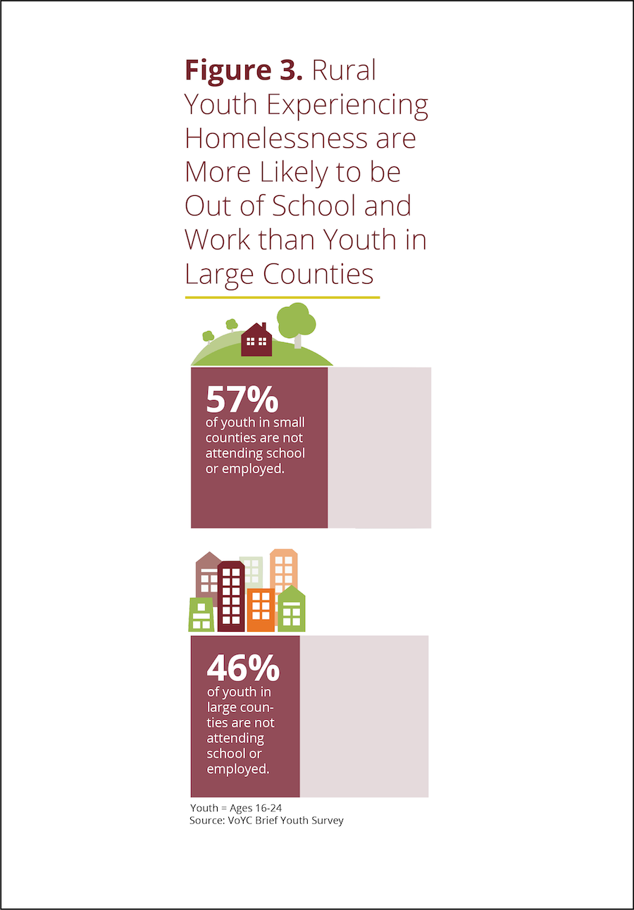
Take a look at example A below. Then take a look at example B.

Example A
Example B
Both are bar charts showing the same data. But B wins, hands down. Why?
Chart A truncates the Y-axis making the difference between large and small counties look bigger than it actually is. Chart B, by contrast, fills in the whole bar and darkens the portion not attending school or employed, thus giving us a sense of the size of both groups (those who are in and out of of school and work) in large and small counties.
Chart B points us to the conclusion it wants us to draw with the title and annotations.
Chart B doesn’t have unnecessary and distracting visual elements such as gridlines and axes labels.
Chart B provides images to further emphasize the contrast between large and small counties.
See other data tips in this series for more information on how to effectively visualize and make good use of your organization's data.