Another Data Viz Resource You Should Know: USAFacts

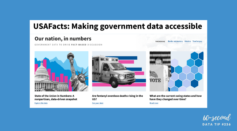
Here’s a new addition to my highly-curated resources list: USAFacts. I occasionally write a 60-second data tip describing a particular resource, including why I think it’s cool. And I link each of these tips to a resources list on my website.

What is it?

USAFacts is dedicated to making government data more accessible. The idea is to help people understand where their tax dollars are going and to help those working on issues of concern in the philanthropic, nonprofit, and public sectors to easily access information to inform their decisions.

Who’s it for?

The general public, policymakers, philanthropists, nonprofit managers, and researchers, among others.

Who’s behind it?

After he retired from tech and began to focus on philanthropy, former Microsoft CEO Steve Ballmer wanted to understand what the government spends on programs to help people and the outcomes of those programs. However, unlike businesses, US governments are not mandated to compile reports on their expenditures. He then hired data analysts to compile this data, and this was the origin of USAFacts, a not-for-profit, nonpartisan civic initiative which is solely funded by Ballmer.

Why I think it’s cool

It’s free and the data is shared under a Creative Commons license. They only ask that you credit USAFacts when using their curated material. Most of their data is visualized and all of it is well-documented. Charts can be easily downloaded in an image format or embedded into your website using an embed code like the chart below.


Let’s talk about YOUR data!

Got the feeling that you and your colleagues would use your data more effectively if you could see it better? Data Viz for Nonprofits (DVN) can help you get the ball rolling with an interactive data dashboard and beautiful charts, maps, and graphs for your next presentation, report, proposal, or webpage. Through a short-term consultation, we can help you to clarify the questions you want to answer and goals you want to track. DVN then visualizes your data to address those questions and track those goals.

10 Essential Data Facts For Non-Data People: The Cheat Sheet

Reposted from January 2022

Here are ten data facts for non-data people who, nevertheless, have to deal with data sometimes (i.e. most of us). This is the cheat sheet. Click on the “Learn More” buttons for additional information served up in comic strip format!


Let’s talk about YOUR data!

Got the feeling that you and your colleagues would use your data more effectively if you could see it better? Data Viz for Nonprofits (DVN) can help you get the ball rolling with an interactive data dashboard and beautiful charts, maps, and graphs for your next presentation, report, proposal, or webpage. Through a short-term consultation, we can help you to clarify the questions you want to answer and goals you want to track. DVN then visualizes your data to address those questions and track those goals.


The Power of Substraction

“Perfection is achieved, not when there is nothing more to add, but when there is nothing left to take away.”

―Antoine de Saint-Exupéry, Airman's Odyssey

If you have heard of any data viz guru, it’s probably Edward Tufte. And if you know one thing about Tufte, it’s probably the data-to-ink ratio. The data-to-ink ratio is the amount of ink (or pixels) that convey the data divided by the total ink (or pixels) used in the entire chart. The ratio, according to Tufte, should be as close to one as possible. In other words, most of the ink/pixels should be conveying data, and you should remove as much non-data ink/pixels as possible. Click through Joey Cherdarchuk’s slides below for a great example of what Tufte is talking about.

Source: Darkhorse Analytics

To see past data tips, click HERE.


Let’s talk about YOUR data!

Got the feeling that you and your colleagues would use your data more effectively if you could see it better? Data Viz for Nonprofits (DVN) can help you get the ball rolling with an interactive data dashboard and beautiful charts, maps, and graphs for your next presentation, report, proposal, or webpage. Through a short-term consultation, we can help you to clarify the questions you want to answer and goals you want to track. DVN then visualizes your data to address those questions and track those goals.


Presenting Data Fast and Slow

Reposted from May 2022

Sometimes we approach the challenge of sharing data with others as if we were trying to con a pet into taking a pill. We think that our audience is too busy, disinterested, or distracted to focus on the data. So we wrap it in something that attracts their attention and feed it to them as quickly as possible. The problem with this approach is that it may get the data into their brains—momentarily—but it won’t stay there long. See where the pill ends up in this video.

If we want others to LEARN from the data — which involves not only retaining it but also drawing knowledge from it and applying that knowledge in the future — then we need a different approach. Daniel Kahneman’s Thinking Fast and Slow can help us.

First a little background on how the brain works, according to the evidence Kahneman presents. For learning to happen, information first must get past System 1 of our brains. This is where fast thinking happens. System 1 is the harried gate keeper, madly processing all of the information that comes in through our senses, pitching most of it, keeping only what is deemed necessary. But making it through the gate is only half the battle. Once in, information confronts System 2. This is the part of the brain that allows for conscious thought or slow thinking. The problem is that System 2 is lazy. Conscious thought is hard, and System 2 is always looking for an excuse to avoid it. However, if System 2 engages with information, the resulting knowledge can find its way to long-term memory and learning happens.

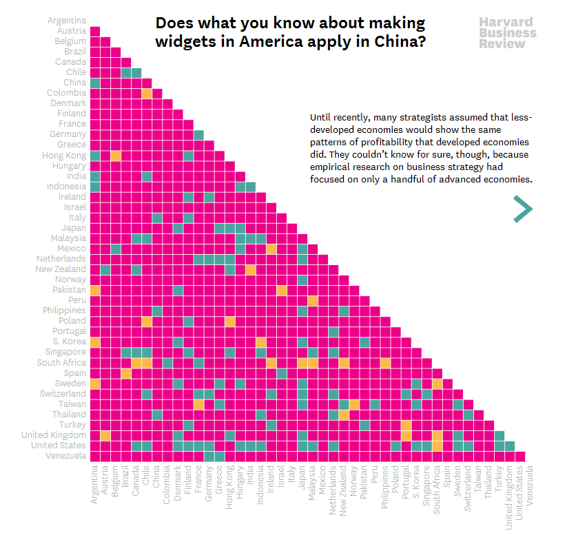
So the challenge when presenting data is to make it past System 1 AND engage System 2. Let’s consider a series of vizes from Harvard Business Review (HBR) that I think meets both parts of this challenge. Yes, it’s an example from the for-profit world, but could easily work with nonprofit data. See snapshot of the first viz in the series below .

How to get data past System 1

Getting data past the System 1 fast-thinking gate keeper is all about grabbing attention. We process images much more quickly than words and numbers, so images are a great foot-in-the-door. The HBR viz does it with bright colors and a cool-looking, somewhat unusual chart. There’s plenty of information out there about how to attract attention, including the use of images with:

  • Stand out colors and textures

  • Human faces (we are wired to focus on them)

  • Novelty (images that are unusual in size, placement, etc.)

Data visualizations can use color as well as images to draw attention. But getting past System 1 is not nearly enough. For learning to happen, the viz also has to engage System 2.

How to engage System 2

System 2 is smart but lazy. So we need to pique its interest. The HBR viz starts with a title that poses a question. When confronted with an interesting question, we may be more likely to stick around for an answer. Then the viz leads you through the answer in a visually engaging way (see interactive version of the viz HERE). These are two great ways to slow down and engage the brain with data. Here’s a list of ways to engage System 2:

  • Ask a question in the title as the HBR viz does—questions beg answers.

  • Make it personal. We may be more likely to engage with data when we have a personal connection with it. This New York Times viz, for example, allows you to enter in your county to see what the barriers to COVID vaccination are in your area.

  • Highlight a surprising finding. Many of us love the counterintuitive and the creative. If you draw attention to something new that the data suggests, you may have a better chance at hooking System 2. For example, this viz from The Economist shows that China emits far less greenhouse gas per person than Western countries at the same stage of economic development. Or check out this viz by Dimiter Toshkov showing that small countries can be big players in development and good governance.

  • Hand draw it. There is some evidence that making information harder to consume, for example by presenting it with harder-to-read fonts, makes the brain slow down and engage in effortful and analytic processing. Although the jury is still out on this, I do find myself more likely to engage in hand-drawn vizes like two of the winners of the World Data Visualization Prize in 2019. Perhaps it’s simply the novelty of hand-drawn charts that engages me. Anyway, it’s something you might consider, and all you need is a pen and paper.

  • Walk them through it. A great way to slow down your viewers is to set the pace by walking them through the data as HBR does in the example. I love how HBR presents what the data might look like if our assumptions were confirmed followed by what it actually looks like.

Sources: Veritasium, Visual Content Space, MIT News, Springer Link,


Let’s talk about YOUR data!

Got the feeling that you and your colleagues would use your data more effectively if you could see it better? Data Viz for Nonprofits (DVN) can help you get the ball rolling with an interactive data dashboard and beautiful charts, maps, and graphs for your next presentation, report, proposal, or webpage. Through a short-term consultation, we can help you to clarify the questions you want to answer and goals you want to track. DVN then visualizes your data to address those questions and track those goals.


Ideas You Should Steal From This Viz (Installment 11)

“Every artist gets asked the question: ‘Where do you get your ideas?’ The honest artist answers, ‘I steal them.’ . . . What a good artist understands is that nothing comes from nowhere. All creative work builds on what came before.” —Austin Kleon in Steal Like An Artist.

Today I offer up another steal-worthy interactive viz that I came across in the Tableau Public Gallery.

Source: Kizley Benedict on Tableau Public

Here’s what I suggest you steal from this viz:

  • Beeswarm Chart. The beeswarm chart at the top allows you to easily compare several countries and to see the overall distribution along the Gender Inequality Index among large and small countries. For more on beeswarm charts, see this tip.

  • Highlight a Country. For users who want to know about a particular country, the dashboard provides a search tool which highlights the selected country.

  • Overall Then Zoom In. After getting a sense of the overall distribution from the beeswarm chart, the user can zoom in and make comparisons among and within regions with the maps along the bottom of the dashboard.

To see past data tips, click HERE.


Let’s talk about YOUR data!

Got the feeling that you and your colleagues would use your data more effectively if you could see it better? Data Viz for Nonprofits (DVN) can help you get the ball rolling with an interactive data dashboard and beautiful charts, maps, and graphs for your next presentation, report, proposal, or webpage. Through a short-term consultation, we can help you to clarify the questions you want to answer and goals you want to track. DVN then visualizes your data to address those questions and track those goals.


Don't Measure Impact . . . Wait, What?

Reposted from September 2022

Ghost of Christmas Yet To Come in The Chrismas Carol by Charles Dickens, Illustration by J. Leech, Source: Flickr

Most organizations should not waste time and money on impact evaluations. Measuring impact is difficult and expensive. It’s difficult because you need a good counterfactual. A counterfactual is what Dickens’s Ghost of Christmas Yet to Come shows Ebenezer Scrooge: what would happen if you did not change anything. The impact of an intervention or program is the difference between what happened and what would have happened without the intervention. Since, in the real world, you can’t observe the same group of beneficiaries with and without the intervention (as we do when we watch The Christmas Carol), you need a good proxy for the would-have-been condition. The best proxy is a group of potential beneficiaries that were randomly selected from a larger group of potential beneficiaries. These folks do not get the intervention. Then you can compare those who did and did not receive the intervention over time to estimate the impact of the intervention. This is called a randomized control trial or RCT.

Of course, withholding an intervention from potential beneficiaries can be a difficult and morally-questionable pursuit. And tracking a large group of beneficiaries and non-beneficiaries over time is expensive. This usually requires a team of skilled data collectors and analysts. Non-randomly-selected comparison groups are not nearly as good because they may differ from the intervention group in known or unknown ways. So it’s difficult to determine if the outcomes observed are due to the intervention itself or to pre-existing biases or characteristics. This costly and challenging process is further complicated by the need to start with a well-established intervention, one that has already worked out the kinks.

Due to the many challenges of measuring impact, most organizations should not waste time and money on impact evaluations. Instead, they should consider interventions that already have a strong research base, ideally because they have been rigorously tested with RCTs. (Check out: Where to Search for Evidence of Effective Programs.)

In a Stanford Social Innovation Review article, Mary Kay Gugerty and Dean Karlan suggest that, before beginning a new program, organizations ask: “What do other evaluations say about it? How applicable is the context under which those studies were done, and how similar is the intervention? Study the literature to see if there is anything that suggests your approach might be effective.”

Rather than assessing impact, your limited resources are better spent assessing implementation. You can do this by collecting data that shows whether what you planned is actually happening. If you can pinpoint where the problems are, you are in a better position to make fixes, alter plans, refine processes.  Many organizations make their plans using a logic model (aka theory of change). A logic model is a flow chart with inputs and outputs. The best logic models draw on past impact evaluations to determine what inputs are most likely to lead to what outputs. And organizations can easily assess progress to date by plugging their logic models into real time data. Interested? Read more about “living logic models” HERE.

To see past data tips, click HERE.


Let’s talk about YOUR data!

Got the feeling that you and your colleagues would use your data more effectively if you could see it better? Data Viz for Nonprofits (DVN) can help you get the ball rolling with an interactive data dashboard and beautiful charts, maps, and graphs for your next presentation, report, proposal, or webpage. Through a short-term consultation, we can help you to clarify the questions you want to answer and goals you want to track. DVN then visualizes your data to address those questions and track those goals.


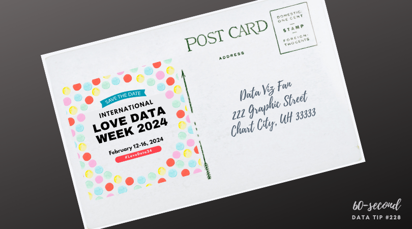
It's Love Data Week!

What’s that?

Love Data Week is an international celebration of data, taking place every year during the week of Valentine's Day. Nonprofit organizations, universities, government agencies, corporations and individuals are encouraged to host and participate in data-related events and activities.

What’s in it for me?

Lots of free online events, many of which are relevant to nonprofit work such as workshops on data visualization, infographics, data resources, data privacy, etc. See a full list of events HERE.

Where can I learn more?

HERE.

To see past data tips, click HERE.


Let’s talk about YOUR data!

Got the feeling that you and your colleagues would use your data more effectively if you could see it better? Data Viz for Nonprofits (DVN) can help you get the ball rolling with an interactive data dashboard and beautiful charts, maps, and graphs for your next presentation, report, proposal, or webpage. Through a short-term consultation, we can help you to clarify the questions you want to answer and goals you want to track. DVN then visualizes your data to address those questions and track those goals.


Best Data Viz of 2023

Looking for a fun (if somewhat geeky) study/work break? Check out these best-of lists for 2023:

New York Times

Visual Capitalist

538/ABC News

FlowingData

To see past data tips, click HERE.


Let’s talk about YOUR data!

Got the feeling that you and your colleagues would use your data more effectively if you could see it better? Data Viz for Nonprofits (DVN) can help you get the ball rolling with an interactive data dashboard and beautiful charts, maps, and graphs for your next presentation, report, proposal, or webpage. Through a short-term consultation, we can help you to clarify the questions you want to answer and goals you want to track. DVN then visualizes your data to address those questions and track those goals.


The Allure and Danger of Data Stories

Reposted from December 2018

I recently read Has Data Storytelling Reached Its Peak? in which Amanda Makulec suggests that we use the term “data storytelling” cautiously. “Not every piece of data needs to be communicated as a story,” Makulec notes. “Sometimes we need to start with story-finding or just a well structured chart, rather than a full narrative arc.” I’ve had my own concerns about the term “data storytelling” which I’m sharing with you (again) today.

***

“Data” and “storytelling” are an item. You see them together all the time lately. When I first came across the term “data storytelling,” it instantly appealed to me. “Data” suggests credibility, information that has some objective basis. But data, to many of us, is boring. Its meaning is often uncertain or unclear. Or, even worse, it’s both. “Storytelling,” by contrast, suggests clarity, a plot with both excitement and resolution. So, by coupling these two words, we seem to get the best of both worlds. Data lend credibility to stories. Stories lend excitement and clarity to data.

Indeed, that’s the point of data storytelling. As Brent Dykes, a data storytelling evangelist of sorts, noted in a 2016 Forbes article, “Much of the current hiring emphasis has centered on the data preparation and analysis skills—not the ‘last mile’ skills that help convert insights into actions.” That’s where data storytelling comes in, using a combination of narrative, images, and data to make things “clear.”

But let’s step back just a minute. Why are we so drawn to stories? According to Yuval Harari, author of Sapiens: A Brief History of Humankind, the answer is:  survival. Harari maintains that humans require social cooperation to survive and reproduce. And, he suggests that to maintain large social groups (think cities and nations), humans developed stories or “shared myths” such as religions and corporations and legal systems. Shared myths have no basis in objective reality. Reality includes animals, rivers, trees, stuff you can see, hear, and touch. Rather, stories are an imagined reality that governs how we behave. The U.S. Declaration of Independence states: “We hold these truths to be self-evident: that all men are created equal . . . “ Such “truths” may have seemed obvious to the framers, but Harari notes that there is no objective evidence for them in the outside world.  Instead, they are evident based on stories we have told and retold until they have the ring of truth.

So stories (in the past and present) are not about telling the whole truth and nothing but the truth. Instead, they are often about instruction: whom to trust, how to behave, etc. And we should keep this in mind when telling and listening to “data stories.” To serve their purpose, stories leave out a lot of data — particularly data that doesn’t fit the arc of the story. For example, you might not hear about a subgroup whose storyline is quite different from the majority. Or, indeed the story might focus exclusively on a subgroup, ignoring truths about the larger group.

Bottom line: listener beware. A story, whether embellished with data or not, is still just a story. And truth can lie both within and outside of that story.


Let’s talk about YOUR data!

Got the feeling that you and your colleagues would use your data more effectively if you could see it better? Data Viz for Nonprofits (DVN) can help you get the ball rolling with an interactive data dashboard and beautiful charts, maps, and graphs for your next presentation, report, proposal, or webpage. Through a short-term consultation, we can help you to clarify the questions you want to answer and goals you want to track. DVN then visualizes your data to address those questions and track those goals.


Two Ways to Offer The "Just Right" Data Portion

60-SECOND DATA TIP #8 (3).png

Reposted from June 2018

Pretend that you are Goldilocks and your porridge is data. How much data is just right? Just enough to engage your funders, staff, or board members, but not so much as to be overwhelming?

To answer this question, we might consider Miller’s Law. George A. Miller was a psychology professor at Princeton University and wrote one of the most frequently cited papers in psychology: "The Magical Number Seven, Plus or Minus Two: Some Limits on Our Capacity for Processing Information."

Miller conducted experiments on human memory and concluded that the number of objects that an average human can remember in the short-term is 7 ± 2.  Objects can include symbols like numbers or abstract concepts. We also can hold several groups of related objects in mind.

Armed with this knowledge, we can make visualizations of data (charts, maps, graphs) easier to digest by:

1) Grouping data into categories. Whenever you have a graph or chart with more than 5 data categories, the individual units start to lose their individuality and are perceived by our eyes as a single whole. In the “before” and “after” examples below, the after chart is easier to process because it combines data on donors into just two groups: those in Chicago and those in other cities.

2) Highlight one or two single categories and gray out the rest. The second chart below (called a parallel coordinates chart) includes a line for each of the 50 states showing the prevalence of various diseases in each state. But only one state (Hawaii) is highlighted and the rest are grayed out. Thus there are really only two data categories to compare: 1) Hawaii and 2) the rest of the states.

BEFORE: TOO MANY GROUPS

many groups.jpg

AFTER: JUST TWO GROUPS

two groups.jpg

HIGHLIGHT ONE GROUP

hawaii.jpg

Let’s talk about YOUR data!

Got the feeling that you and your colleagues would use your data more effectively if you could see it better? Data Viz for Nonprofits (DVN) can help you get the ball rolling with an interactive data dashboard and beautiful charts, maps, and graphs for your next presentation, report, proposal, or webpage. Through a short-term consultation, we can help you to clarify the questions you want to answer and goals you want to track. DVN then visualizes your data to address those questions and track those goals.


Interesting Versus Actionable Data

60-SECOND DATA TIP_4 (3).gif

Reposted from October 2021

It’s easy to get lost in a sea of interesting data when what you really need is actionable data. As Oracle’s Nate Mayfield points out, you know when you’ve presented only interesting data when you get this type of response: “Oh, cool. Yeah, that's great to know.” On the other hand, if you hear “Oh, okay. I can definitely decide what to do now,” then you’ve presented actionable data.

The key to presenting actionable data is to ask specific—rather than broad—questions. And then design your charts, maps, and graphs to answer those narrower questions. Mayfield’s article focuses on the types of questions a business might ask. Let’s consider the types of questions a nonprofit might ask:

Interesting Questions.png

Mayfield notes that data dashboards that are designed for a wide range of users tend to address only interesting questions. “Because they are intended for a broad set of users, with a lot of filters, you can in theory answer a lot of questions with these sprawling dashboards,” says Mayfield. “The problem is people quickly get lost in them and don’t spend the time required to answer their questions.” Instead, Mayfield advises us to create simple dashboards that answer quite specific questions such as the actionable questions above. So consider a series of simple dashboards, each designed to provide answers that prompt action for a particular type of user.

To see past data tips, including tips on other types of pantry staple data, click HERE.


Let’s talk about YOUR data!

Got the feeling that you and your colleagues would use your data more effectively if you could see it better? Data Viz for Nonprofits (DVN) can help you get the ball rolling with an interactive data dashboard and beautiful charts, maps, and graphs for your next presentation, report, proposal, or webpage. Through a short-term consultation, we can help you to clarify the questions you want to answer and goals you want to track. DVN then visualizes your data to address those questions and track those goals.


What Averages Obscure

Copy of 60-SECOND DATA TIP #8.png

Reposted from January 2018

Nonprofits (and everyone else) are addicted to averages. We like to talk about how participants do on average. We might describe how many visitors we have in an average week. But how much are we missing when we focus solely on averages? Short answer: it depends, but it could be a lot. If I only showed you the average sized person in the picture above, would you appreciate the full range of sizes?

To figure out what and how much we are missing, we need to calculate—or better yet show—how spread out our data points are. Understanding the spread gives us an idea of how well the average represents the data. When the spread of values in the data set is large, the average obscures the real picture more than when the spread is small.

Spread measures include range, quartiles, absolute deviation, variance and standard deviation. For more on these measures, check this out. 

A great way to quickly grasp the spread of your data is to make a box plot. A box plot (aka. box and whisker diagram) shows the distribution of data including the minimum, first quartile, median, third quartile, and maximum. The box plots below show the affordability of neighborhoods in five cities. Each red circle represents a zip code area. The gray boxes show where 50 percent of the zip code areas fall on the affordability scale. And the median (the middle point in a dataset) is where the dark gray meets the light gray. You can see that, in general (i.e according to the median), New York is more affordable than Los Angeles. However, New York has some zip code areas that are much less affordable than the median seems to suggest.

So when looking at your data, don’t just look at averages, also consider the spread.

boxplot2.jpg

Image created by Moxilla for Noun Project.


Let’s talk about YOUR data!

Got the feeling that you and your colleagues would use your data more effectively if you could see it better? Data Viz for Nonprofits (DVN) can help you get the ball rolling with an interactive data dashboard and beautiful charts, maps, and graphs for your next presentation, report, proposal, or webpage. Through a short-term consultation, we can help you to clarify the questions you want to answer and goals you want to track. DVN then visualizes your data to address those questions and track those goals.


Bar Chart Hack #7: The Lollipop Chart

Reposted from February 2019

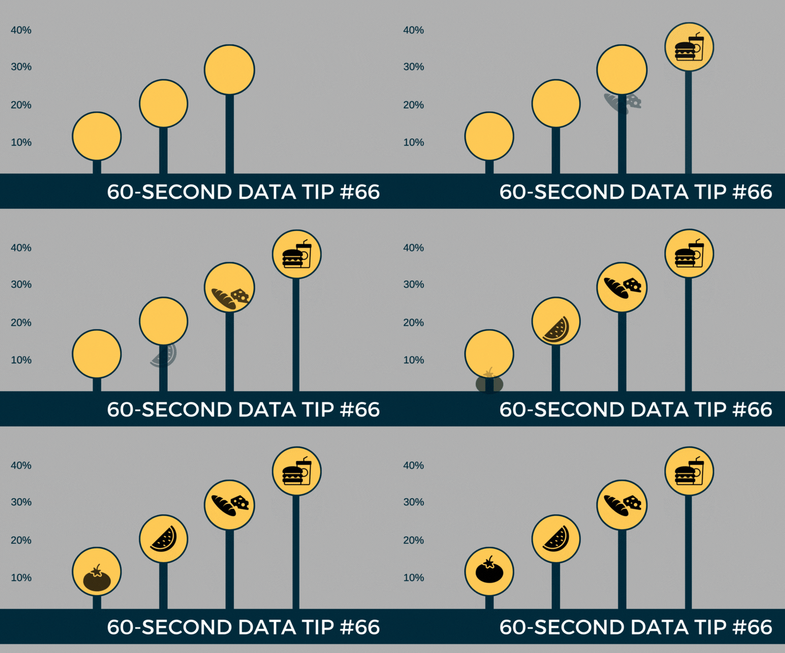
The lollipop chart provides a short and sweet addition to the 60-Second Data Tip series, “How to Hack a Bar Chart.”

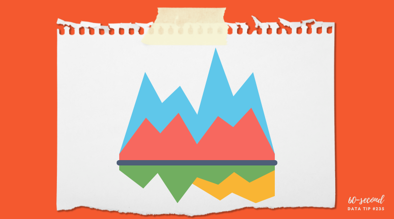
A lollipop chart is nothing more than thin bars with circles on top. So why go to the trouble? Well, if you have a lot of bars of similar length, you should not go to the trouble. The circles will just make comparing the lengths of the bars more difficult.

But the lollipop chart can be helpful when you have a bunch of bars of varying lengths, and you want to set them apart in a visually interesting way. Also, you can use those circles as labels, as in the example above.

Check out these easy instructions for making lollipop charts in Tableau and Excel.

To see past data tips, click HERE.

Icons created by Ben Davis, Dinosoft Labs, and andrewcaliber from Noun Project.


Let’s talk about YOUR data!

Got the feeling that you and your colleagues would use your data more effectively if you could see it better? Data Viz for Nonprofits (DVN) can help you get the ball rolling with an interactive data dashboard and beautiful charts, maps, and graphs for your next presentation, report, proposal, or webpage. Through a short-term consultation, we can help you to clarify the questions you want to answer and goals you want to track. DVN then visualizes your data to address those questions and track those goals.


Bar Chart Hack #6: The Funnel Chart

Reposted from February 2019

Today we arrive at Episode 6 of the 60-Second Data Tip series, “How to Hack a Bar Chart.” As we have discussed, bar charts are user-friendly and familiar, but familiarity can breed contempt. So this week we consider yet another variation of the bar chart called the funnel chart.

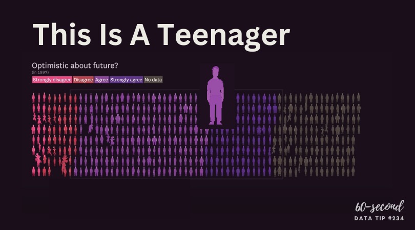
The funnel chart is used to visualize a process and how the amount of something decreases as it progresses from one phase to another. You might think of it as a pipeline.

The example below shows the decreasing number of participants at each stage of a food service training program. We can see that few of those who attend orientation make it all the way to a job. And we can see where there is the most/least drop off. This funnel is also interactive. You can see the funnels for particularly subgroups by changing the filter at the top.

It looks cool and makes intuitive sense, but a funnel chart is just a bar chart on its side with a mirror image. Check out these easy instructions for making funnel charts in Tableau and Excel.


To see past data tips, click HERE.


Let’s talk about YOUR data!

Got the feeling that you and your colleagues would use your data more effectively if you could see it better? Data Viz for Nonprofits (DVN) can help you get the ball rolling with an interactive data dashboard and beautiful charts, maps, and graphs for your next presentation, report, proposal, or webpage. Through a short-term consultation, we can help you to clarify the questions you want to answer and goals you want to track. DVN then visualizes your data to address those questions and track those goals.


Bar Chart Hack #4: Radial Charts

3.png

Reposted from February 2019

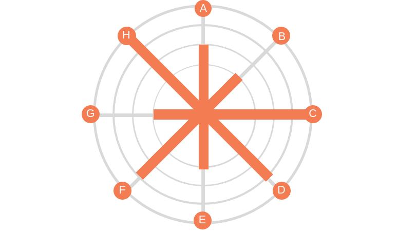
Welcome to Episode 3 of “How to Hack a Bar Chart.” This time we consider two bar chart subspecies that recast the regular bar chart in circular form. They may be eye-catching but be careful how you use them.

1.png

Radial Column Chart: (aka Circular Column Graph or Star Graph). As you can see in the example above, the bars on this chart are plotted on a grid of concentric circles, each representing a value on a scale. Usually, the inner circles represent lower values and values increase as you move outward. Sometimes each bar is further divided using color to show subgroups within each category. Because we are better at assessing length along a common scale, this type of chart isn’t ideal if you want viewers to accurately compare the lengths of each bar. However, these charts are great at showing cyclical patterns. Florence Nightingale used this type of chart (which she called a “polar area chart”) to show a cyclical pattern in the number and causes of death in the Crimean War.

This work is in the public domain in its country of origin and other countries and areas where the copyright term is the author's life plus 70 years or less.

2.png

Radial Bar Chart (aka Circular Bar Chart) is simply a bar chart in which the bars curve around a circle, like runners on a circular track. As you may recall, races on circular or oval running tracks include staggered starting lines so that runners on the outer (longer) tracks run the same distance as those on the inner (shorter) tracks. But the bars on a radial chart have the same starting line making it difficult to compare lengths. So skip the radial bar chart. Not worth the effort.

To see past data tips, click HERE.


Let’s talk about YOUR data!

Got the feeling that you and your colleagues would use your data more effectively if you could see it better? Data Viz for Nonprofits (DVN) can help you get the ball rolling with an interactive data dashboard and beautiful charts, maps, and graphs for your next presentation, report, proposal, or webpage. Through a short-term consultation, we can help you to clarify the questions you want to answer and goals you want to track. DVN then visualizes your data to address those questions and track those goals.


Bar Chart Hack #3: The Combo Chart

60-SECOND DATA TIP_3.png

Reposted from January 2019

Welcome to another episode in the 60-Second Data Tip series, “How to Hack a Bar Chart.” As we have discussed, bar charts are user-friendly and familiar, but like all things familiar, they can be boring and easy-to-ignore. This week we consider—in about 30 seconds— how to combine a bar chart with another type of chart to wake us up and engage us.

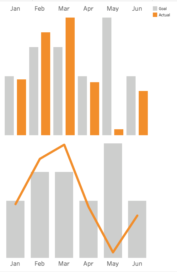
Consider the two charts below. Both show the same data: fundraising goals vs. actual funds raised. The one on top uses bars for both categories. The bottom one uses bars for the goals and lines for actual amounts.

Which works better? I vote for the bottom one. It makes comparing values between two different categories easier because it uses not only different colors to distinguish them but different “encodings” (bars and lines).  The bottom chart gives us a clear view of when we are exceeding or falling short of our goals in any given month.

combo chart image.png

To see past data tips, click HERE.


Let’s talk about YOUR data!

Got the feeling that you and your colleagues would use your data more effectively if you could see it better? Data Viz for Nonprofits (DVN) can help you get the ball rolling with an interactive data dashboard and beautiful charts, maps, and graphs for your next presentation, report, proposal, or webpage. Through a short-term consultation, we can help you to clarify the questions you want to answer and goals you want to track. DVN then visualizes your data to address those questions and track those goals.


Bar Chart Hack #2: The Icon Bar Chart

60-SECOND DATA TIP_3.png

Reposted from January 2019

Welcome to Episode 2 of “How to Hack a Bar Chart.” This mini-series shows you how to take something that works well and that folks understand and move it in a more creative and engaging direction. This time, you meet a close cousin of the bar chart, but this cousin is more interesting than its relative. It has icons.

This is what you should NOT do with icons: make them into bars. Here’s why: bar charts are powerful (if boring) because we can easily compare their lengths. When icons or images are used in place of bars, such comparisons are more difficult to make. See the first example below showing how many clients live in different types of homes. It’s quite a challenge to determine how many more clients live in suburban homes vs. high rises. That’s because the height of the icons are difficult to assess.

2.png

The second example makes it a little easier. But I’d argue that in both examples 1 and 2, the icons make the viewer’s job (comparing lengths) unnecessarily difficult.

3.png

The third example, introduces bars back into the bar chart and thus requires minimal viewer effort.

60-SECOND+DATA+TIP_3+%281%29.jpg

And the fourth further lightens the load by removing the Y-axis and directly labeling the bars and placing the bars closer together.

5.jpg

To see past data tips, click HERE.

Image credits: House by ANTON icon from the Noun Project, company by Angriawan Ditya Zulkarnain from the Noun Project, Farm by Ferran Brown from the Noun Project


Let’s talk about YOUR data!

Got the feeling that you and your colleagues would use your data more effectively if you could see it better? Data Viz for Nonprofits (DVN) can help you get the ball rolling with an interactive data dashboard and beautiful charts, maps, and graphs for your next presentation, report, proposal, or webpage. Through a short-term consultation, we can help you to clarify the questions you want to answer and goals you want to track. DVN then visualizes your data to address those questions and track those goals.


Bar Chart Hack #1: The Divergent Stacked Bar Chart

60-SECOND DATA TIP.png

Reposted from January 2019

Last week I promised to arm you with useful bar chart hacks. The idea is to take something that works well and that folks understand but move it in a more creative and interesting direction.

So this week I give to you: The Divergent Stacked Bar Chart.

Okay, so you know what a bar chart is. And you probably know what a stacked bar chart is, even if you don’t call it that. It uses color to show the subgroups that comprise each bar (or larger group) in the chart like this:

bar.png

Regular Stacked Bar Chart

Now the cool, or divergent, part. It’s easier to show you than to describe it. So take a look:

returnstohomelessness.jpg

Divergent Stacked Bar Chart

As you can see, the the divergent chart aligns each bar around a common midpoint. So it’s much easier to compare, for example, positive and negative values across categories.

Stephanie Evergreen provides directions on making a divergent stacked bar chart in Excel. And here are instructions on creating such a chart in Tableau. Other data viz softwares can make this chart too.

For a much deeper dive into the data viz world’s debate over when and if to use divergent stacked bar charts, check out this article by Daniel Zvinca.

To see past data tips, click HERE.


Let’s talk about YOUR data!

Got the feeling that you and your colleagues would use your data more effectively if you could see it better? Data Viz for Nonprofits (DVN) can help you get the ball rolling with an interactive data dashboard and beautiful charts, maps, and graphs for your next presentation, report, proposal, or webpage. Through a short-term consultation, we can help you to clarify the questions you want to answer and goals you want to track. DVN then visualizes your data to address those questions and track those goals.


How To Hack A Bar Chart

Reposted from January 2019

Choosing a chart type is like making breakfast for your kids. Bar charts are Cheerios. You know they will eat it and it’s healthy. Now come the buts:

But #1:  Cheerios is boring and you wish they had a wider palate.

But #2: If you give them a quinoa breakfast bowl, it will go uneaten and you might as well have given them Cheerios.

When it comes to data visualization, Maarten Lambrechts says don't settle for Cheerios. He calls the problem “xenographobia” or the fear of weird charts. And he implores us to boost our viewers’ “graphicacy” by feeding them the equivalents of quinoa breakfast bowls in the chart world.

Here’s what I think. We should neither spook our children at breakfast time nor our funders, board members, and staff throughout the day. But we should try to slowly widen their palates. One way to do that is to take something they know and love and hack it a bit. Throw some nuts on the Cheerios. Use color in novel ways to enliven a bar chart.

Over the next several weeks, I will offer up different ways to hack a bar chart. Stay tuned!

To see past data tips, click HERE.


Let’s talk about YOUR data!

Got the feeling that you and your colleagues would use your data more effectively if you could see it better? Data Viz for Nonprofits (DVN) can help you get the ball rolling with an interactive data dashboard and beautiful charts, maps, and graphs for your next presentation, report, proposal, or webpage. Through a short-term consultation, we can help you to clarify the questions you want to answer and goals you want to track. DVN then visualizes your data to address those questions and track those goals.


How To Make Your Data Viz More Accessible: Screen Readers and Keyboard Navigation

In a series of 60-second data tips, I’m taking on one basic accessibility issue at a time. This week it’s about screen readers and keyboard navigation. We do not all perceive in the same way. Some people with vision or physical limitations, navigate charts, graphs, and maps using only the keyboard (no mouse) and screen readers to understand the content.

A screen reader is an assistive technology primarily used by people with vision impairments. It converts text, buttons, images and other screen elements into speech or braille. Here’s one in action:

Source: Highcharts on YouTube

You can make your data visualizations more screen reader- and keyboard-friendly by doing the following:

1) Understand the capabilities of the tool you use to create visualizations.

Some simple Googling can help you to figure this out. For example, if you use Tableau, this page explains that once you publish and embed a Tableau dashboard into a web page that conforms to Web Content Accessibility guidelines (WCAG 2.0 AA), screen readers should be able to interpret them. Further, dashboards created in Tableau 2021.3 and later have a default top-to-bottom, left-to-right “focus order” (i.e. the order in which elements of a visualization are narrated by a screen reader).

2) Reduce the number of marks in visualizations.

Marks are the visual elements used to represent data in a chart, graph, or map. Think bars, lines, circles, etc. When there are a lot of marks, it can be difficult to understand a visualization using a screen reader. You can reduce the number of marks by:

  • Including only the most important data points,

  • Aggregating data points into groups (e.g. rather than showing the population of 40 cities with 40 bars, you could group them into small, medium, and large cities and show just three bars representing the average population for each group), and

  • Adding filters that allow the user to see fewer data points at a time.

3) Add text that clarifies the content of the visualization

Titles, subtitles, captions, and legends make a visualization more accessible to everyone including those using screen readers.

If you are interested in a deep dive into accessibility issues and solutions, you can find plenty of information online including Chartability.

To see past data tips, click HERE.


Let’s talk about YOUR data!

Got the feeling that you and your colleagues would use your data more effectively if you could see it better? Data Viz for Nonprofits (DVN) can help you get the ball rolling with an interactive data dashboard and beautiful charts, maps, and graphs for your next presentation, report, proposal, or webpage. Through a short-term consultation, we can help you to clarify the questions you want to answer and goals you want to track. DVN then visualizes your data to address those questions and track those goals.