
This week’s tip is short and extra sweet.
There is data. And then there is real life. Sometimes there seems to be little relationship between the two. Data seems too rigid or too limited or too boring to capture the brilliant vagaries of the real world. We have a different tool for the vagaries. We call it intuition.
I’m not knocking intuition. But our expectations can weaken our intuition. (See last week’s tip for more on this.) The solution is to bring some data to your decision-making game. And how best to bring it? By visualizing it.
This sounds more complex than it is. Imagine you are not at your computer or in a meeting but instead ordering dessert. The dessert menu is long with lots of text. You are a bit drowsy from digesting your dinner. And you are not sure what you want. So you’ve got data (the menu) and you’ve got a decision to make. And you’re tired. Not a bad analogy to a work setting.
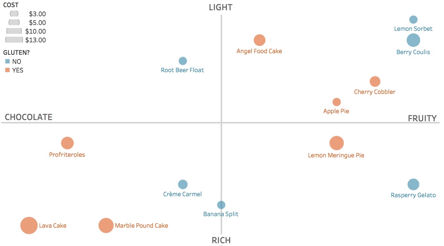
If you could visualize the data to aid your dessert decision, what would you do? You might first decide on the salient decision criteria. For example: richness, flavor, price, and gluten content. Then you might place, size, and color the data to allow easy comparisons among your options. See the quadrants chart below. Want a light, fruity, gluten-free dessert at a low price point? Lemon sorbet is clearly your best bet.
Too often our workplaces and restaurants hinder the journey from data to action. But there are better (and sweeter) ways.
See other data tips in this series for more information on how to effectively visualize and make good use of your organization's data.
Photos by Jennifer Pallian, Henry Be and Brenda Godinez on Unsplash