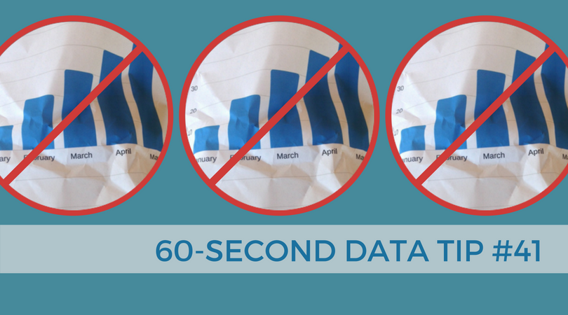
Data viz is getting a lot of hype these days. And, if you have read any of my data tips, you know I’m on the bandwagon. But even a devotee like myself can see that visualizing data is not always best. There are at least two circumstances when you are better off with a drab spreadsheet:
1) You have an already-engaged but diverse audience.
These are folks who are highly motivated to access certain data and won’t be annoyed by having to find that data on a table. Tables use paper or screen real estate efficiently. You can fit a lot of rows and columns in a small space allowing users with different interests to find data in a single table.
2) You have many units of measure.
For example, you want to show the height, weight, location, and satisfaction level of participants in a healthy eating program. This data involves four different units of measure: inches, pounds, latitude/longitude, and survey ratings. Such complexity is difficult to represent on a single visualization but you can do so in a single table quite easily.
See other data tips in this series for more information on how to effectively visualize and make good use of your organization's data.