
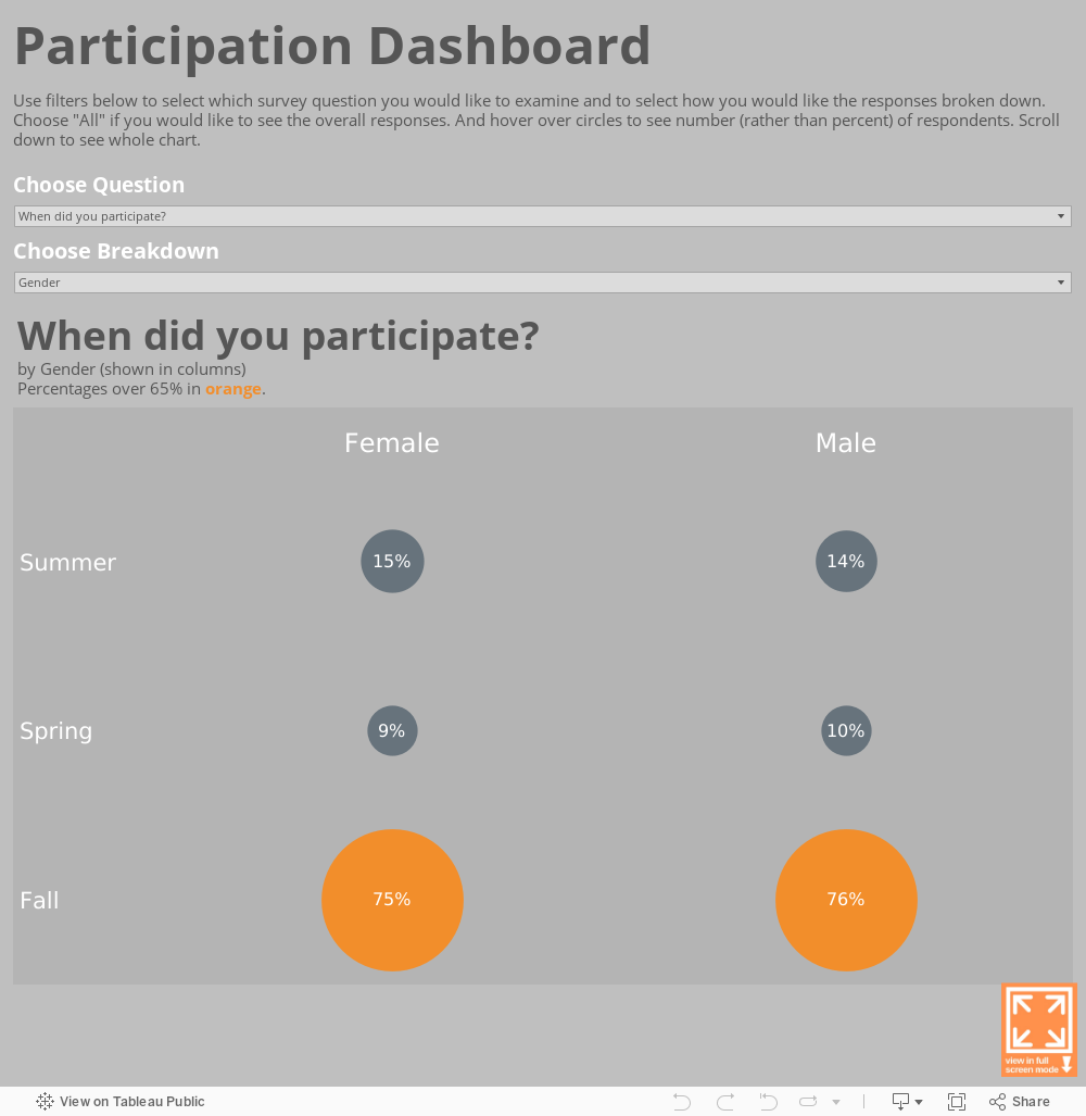
Often, perhaps most of the time, we do best by looking at our data from a number of different vantage points. Sure, we want the broad view: how are all of our participants doing in the program? But we also want to know how particular types of participants are doing such as those in certain age brackets, those who got a certain set of services, those who persisted in program for longer or shorter periods of time, etc. To see our data broken down into such subgroups can be a pain in programs like Excel*. You have to generate a different pivot table for each type of breakdown. But in programs like Tableau, you can create “parameters” that allow you to toggle among different breakdowns easily and painlessly. With some Tableau know-how, you can see how different types of survey respondents responded to different types of question as in the example below.
***
Data Viz for Nonprofits helps organizations to effectively and beautifully present their data on websites, reports, slide decks, interactive data dashboards and more. Click HERE to learn more about our services and HERE to set up a meeting to discuss how we can meet your particular needs.
*If you have a version of Excel with the “slicer” feature, you can have more flexibility in looking at your data from different angles.