When you think of visualizing data, your mind probably goes to bar graphs or maybe pie charts. However, there are many more species of visualizations. Ever heard of a waterfall or a circular area chart? Your first decision when visualizing data is what type of chart or graph to choose and that depends on what you want to show and what type of data you have.
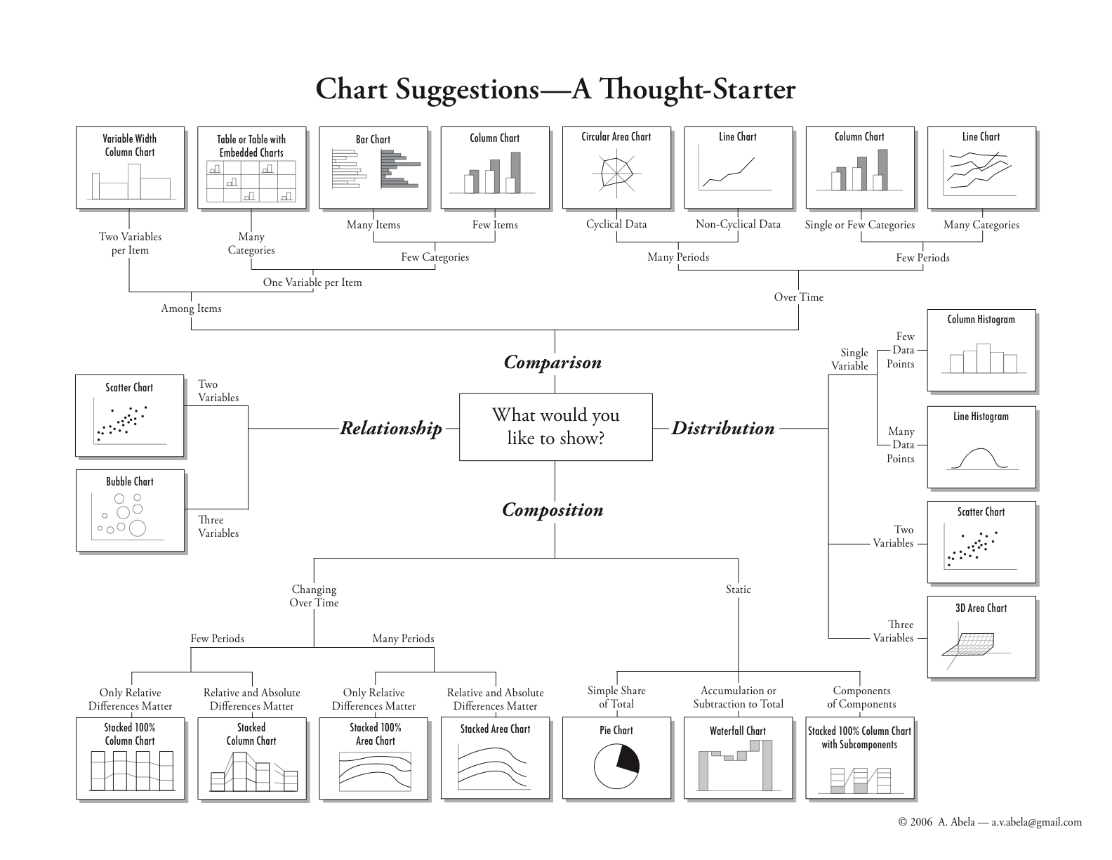
I highly recommend Andrew Abela’s simple decision tree called “Chart Suggestions—A Thought-Starter” (see image below). It’s based on Gene Zelazny's classic work Saying It With Charts. The decision tree starts with the basic question: “What would you like to show?” And provides four options:
Comparison. You have two or more groups of things or people and you want to see which group is largest or smallest (or somewhere in between) on some measure. You also may want to see how these groups compare on the measure over time.
Distribution. You have a bunch of data points (e.g. the ages of participants in a program or test scores of students in a class) and you want to know how spread out or bunched up they are. Are most of the ages, test scores (whatever) near the average? Or is there a wide range? Are there some extreme outliers?
Composition. You want to understand who or what makes up a larger group such as how many of the participants in a program are in different age brackets or how many have been in the program for different lengths of time.
Relationship. You want to know if one thing is related to another, either at one point in time or over time. Do participants in a mental health program report less distress over time? Do those with lower incomes have higher heart rates?
Once you answer this basic question, the decision tree helps you to choose a specific chart based on the type of data you have. Abela’s chart chooser includes the types of charts you are most likely to select. But there are more rare species out there. To learn more about the wide array of ways to visualize data, check out the Data Visualization Catalogue.
See other data tips in this series for more information on how to effectively visualize and make good use of your organization's data.


